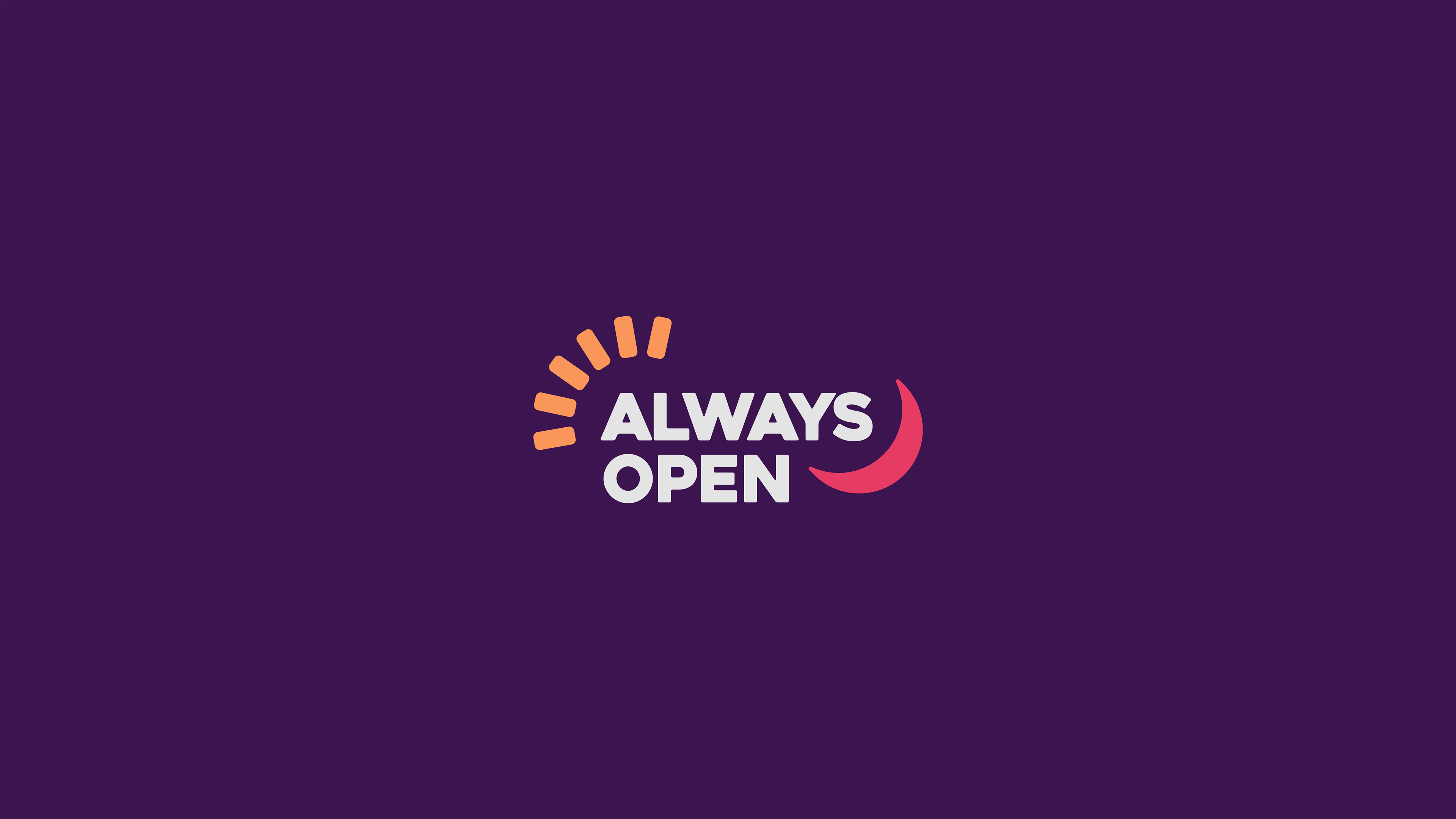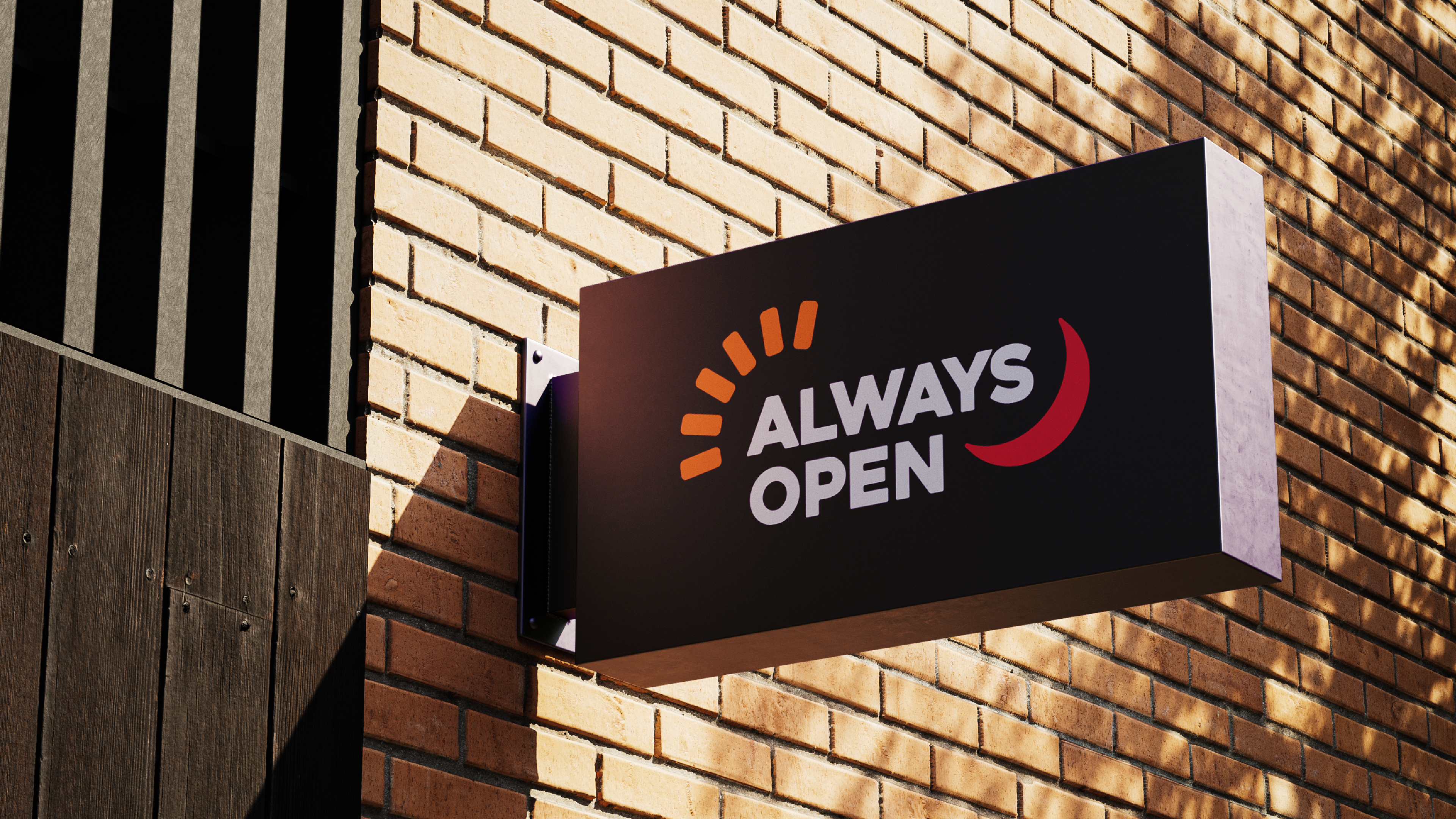
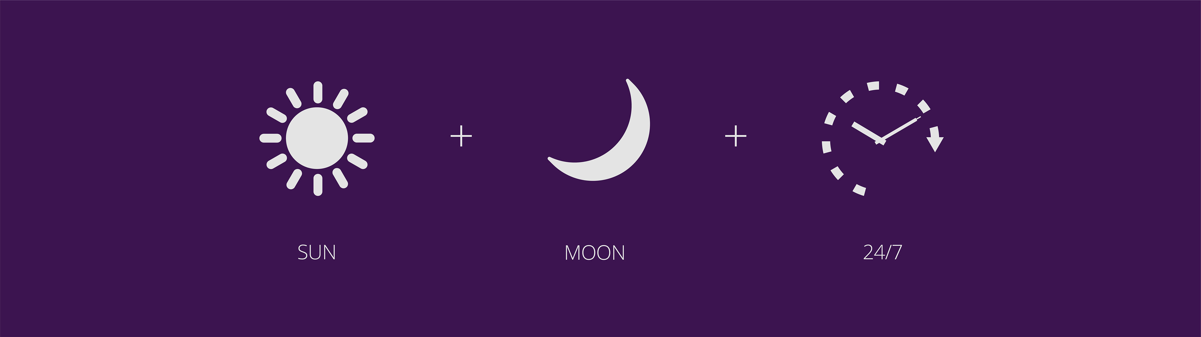
The sun and moon symbols represent the concept of day and night, signifying that the service is available round the clock. The time element further emphasizes the 24/7 availability. By combining these elements in the logo, it visually communicates the idea
of constant accessibility, reinforcing the notion that customers can rely on the vending machines anytime they need.
Additionally, the use of these universal symbols creates a sense of familiarity and understanding among viewers. People intuitively associate the sun with daytime
and the moon with nighttime, making it easier for them to grasp the message conveyed
by the logo.
Overall, this creative direction effectively captures the essence of being open and available at all times through a simple yet meaningful combination of iconic elements.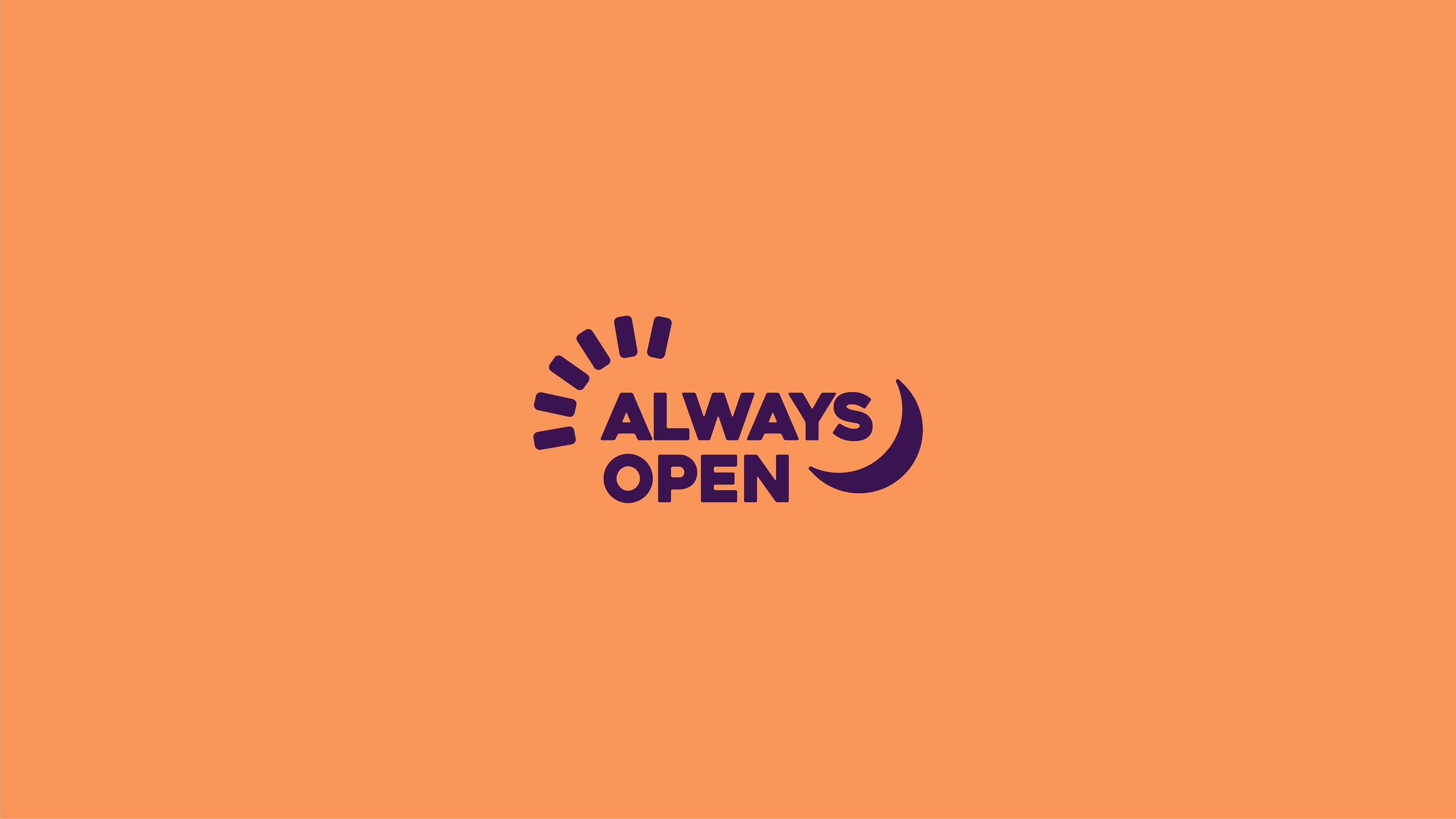